This blog is an ongoing assignment for Gov 1347: Election Analytics, a course at Harvard College taught by Professor Ryan Enos. It will be updated weekly and culminate in a predictive model of the 2024 presidential election.
Introduction – How did our election model fare? What insights did we capture, and where did we miss the mark?
Election season has come and gone, and now it’s time for the real question – how did our model stack up against reality? From economic trends to ground game tactics, polling swings to those elusive “October surprises”, and even shark attacks, we’ve aimed to capture the heart of 2024’s electoral landscape throughout the last couple of weeks.
As we begin our final reflection, I remember the important quote that echoes throughout almost any statistics course – “All models are wrong, but some are useful.” Even in the words of Professor Enos, he writes that the importance of forecasting is so that “…we can learn about important things…”
No model can be flawless, but we’re calling it a win if it got us even close to the truth. So, let’s dive into the final results and see how well we did. Did our predictions hold up? Let’s find out!
And as always, we’ll start with the data…
Let’s take a step back…
Before we get into the actual results, let’s do a brief recap of our final predictive model, which hinged on ANES data, economic factors, and random forest computation to produce its results.
After analyzing feature importance, we found that our model relied heavily on polling data, which offers a real-time snapshot of voter sentiment but might miss economic shocks that shift the mood more gradually. Our polling-focused approach is useful when the electorate’s final choices mirror polling trends, and while economic factors are weighted less, they still set a baseline for understanding overall voter sentiment.
Through my research, I found that economic well-being deeply shapes how voters feel about incumbents. Strong economic conditions generally benefit the current administration, as voters attribute their security to the status quo. In contrast, economic downturns often lead to a desire for change. More abstractly, this aligns with retrospective voting theory, suggesting that voters base decisions on past performance—where the economy plays a key role.
We’ve seen this dynamic before. In the 1980 election, high inflation and unemployment led to voter frustration with President Carter, helping Reagan win by a landslide. Similarly, in 1992, Clinton’s “It’s the economy, stupid” slogan highlighted a recession that hurt Bush’s approval, and so economic issues like unemployment and GDP growth pushed voters to look for a change.
Thus, I decided that by combining ANES data with economic indicators, the model can account for both personal factors (such as demographics and political attitudes) and external, quantifiable economic conditions that influence elections and voter sentiment.
Let’s take a look at what it said:
## Predicted Vote Shares for 2024 Election:
## Democratic candidate (Harris): 52.88 %
## Republican candidate (Trump): 47.72 %
Here, we can see that the model predicted that Harris would win with a small margin, with even a small increase in predicted vote share for Harris compared to previous models once we factored in economic features like GDP, unemployment rate, CPI, and the S&P, which typically favor the incumbent party when the economy is doing well.
However, I was still skeptical about the results, especially as our cross-validation and out-sample tests revealed sharp differences. The out-of-sample test was particularly informative, in which the model is evaluated on data it hasn’t seen, such as holding out certain data points to provide a better assessment of how it might perform on new data.
Let’s take a look at the results:
## Random Forest
##
## 448 samples
##  28 predictor
##
## No pre-processing
## Resampling: Cross-Validated (10 fold)
## Summary of sample sizes: 404, 404, 402, 403, 402, 404, ...
## Resampling results:
##
##   RMSE         Rsquared   MAE
##   0.003043932  0.9999996  0.0009377337
##
## Tuning parameter 'mtry' was held constant at a value of 9
## Tuning
##  parameter 'splitrule' was held constant at a value of variance
##
## Tuning parameter 'min.node.size' was held constant at a value of 5
## [1] "Cross-validated RMSE: 0.00304393235350963"
## [1] "Cross-validated R-squared: 0.999999560925517"
## Training RMSE (excluding 2008 and 2012): 0.0006013352
## Pseudo-Test RMSE (2008 and 2012): 2.430502
The model’s R-squared value near 1 suggests it fits the training data almost perfectly, but this raises concerns about overfitting, as it may be capturing noise rather than true predictive patterns. For the out-of-sample tests, I chose not to test the model on 2016 and 2020 due to unique factors like intense polarization and the pandemic, which could’ve skewed the results.
The large gap between Training RMSE and Pseudo-Test RMSE further indicates that while the model performs well on training data, it struggled with real-world election variability. At the same time, the 2008 and 2012 elections posed interesting factors, with Barack Obama as the first African American presidential nominee for a major party in 2008 and the 2012 election with the 2008 financial crisis still in its rearview mirror.
Thus, the model may not be flexible enough to account for these unusual election dynamics, which could explain the high error.
Finally, we completed repeating samples to generate a prediction interval:
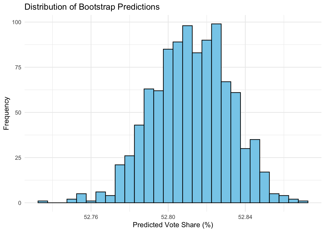
The narrow 95% prediction interval (spanning only ~0.08 percentage points) suggests the model has high confidence in its outcome, with little variability in predictions. However, this may indicate overconfidence, as it doesn’t fully account for last-minute voter shifts and unpredictable factors that often impact elections. This narrow range also suggests that the model may be relying heavily on a few key predictors, making it more deterministic and less adaptable to real-world uncertainties.
So…how’d we do?
With election night in full steam, we gathered eagerly around screens and TVs to watch the US choose its next president. Unfortunately, our model was a bit off, but something tells me a lot of people didn’t see this election swinging the way it did.
Let’s take a look at the state-by-state results:
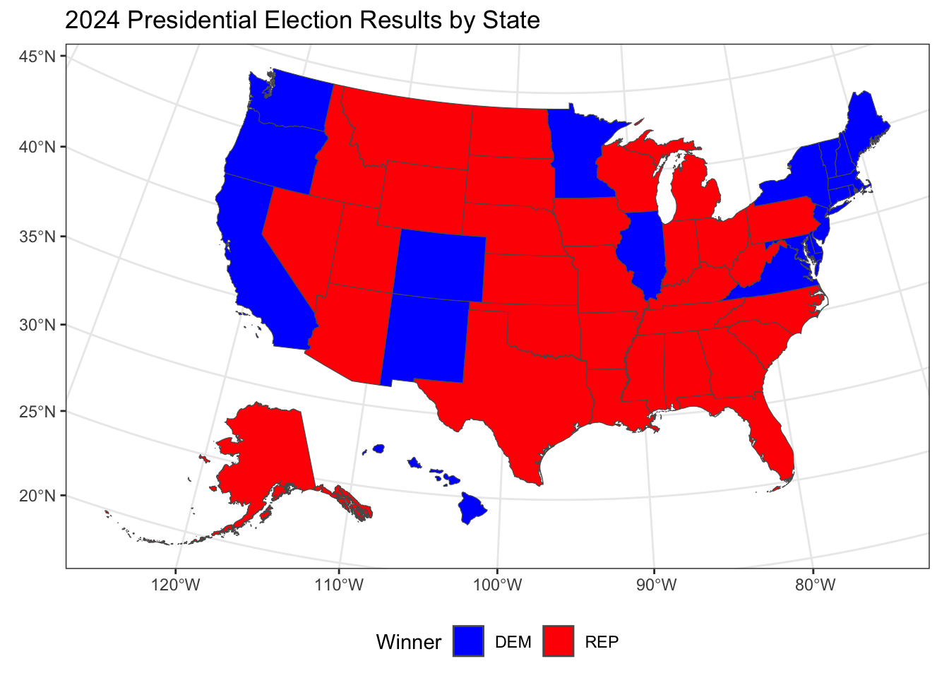
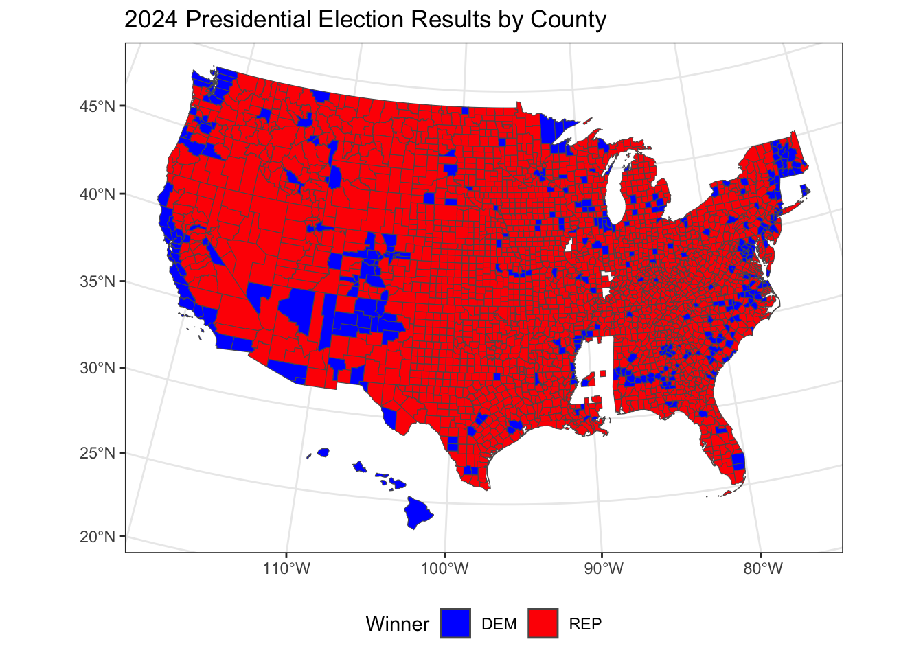
Overall, we observe that Republicans secured a majority of states across the central and southern U.S., while Democrats won in several states along the coasts and a few areas of the Midwest. This reflects a familiar pattern of urban-coastal Democratic support contrasted with Republican dominance in more rural and central regions. In a more granular county-level diagnostic, we observe that Republican support is spread widely across rural areas, while Democratic victories are concentrated in urban centers and some specific regions.
The popular vote reflected similar overall results, with the final count being roughly 51% for Trump and 49% for Harris.
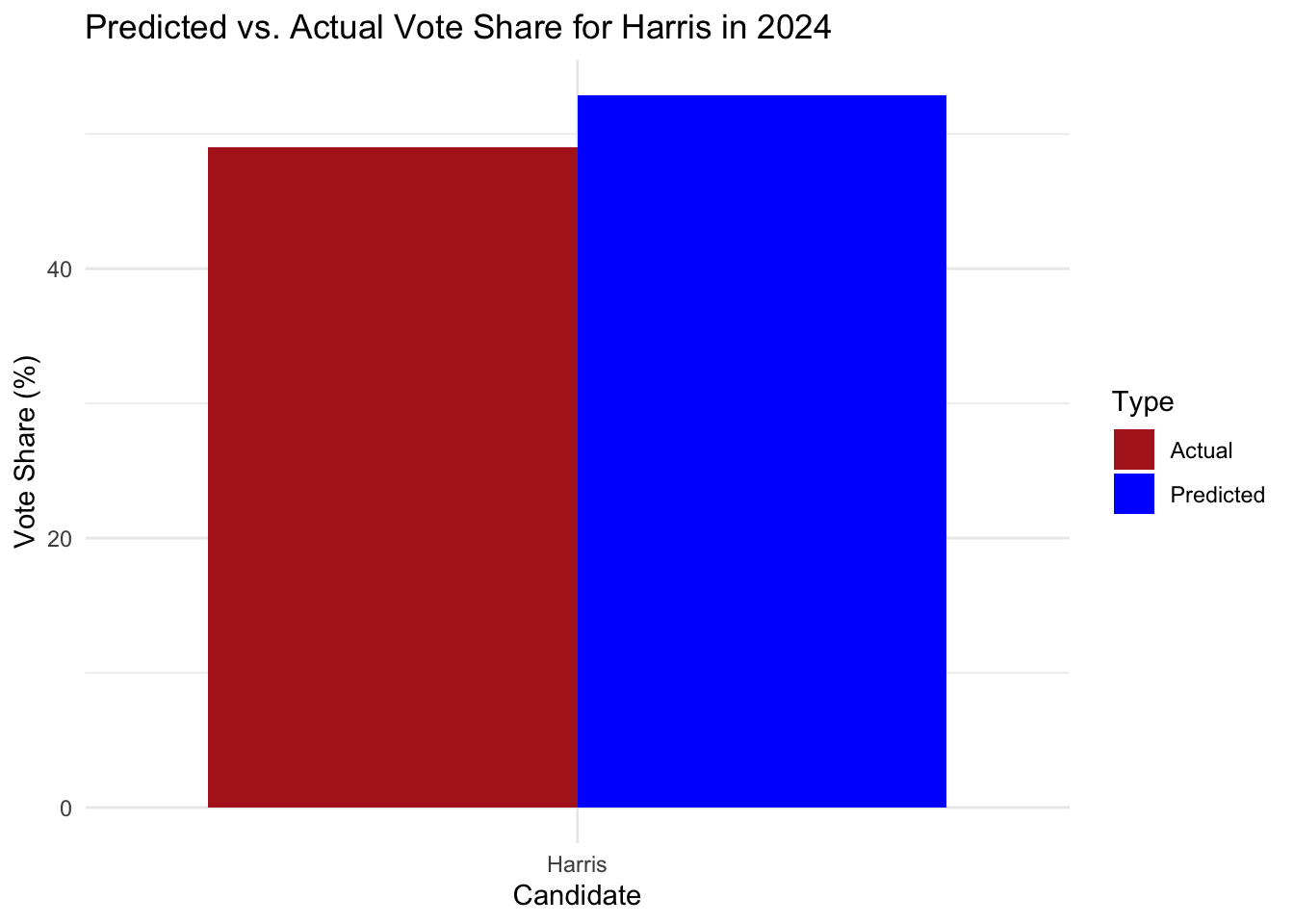
This indicates an overestimation of Democratic support by nearly 4 percentage points, with the most pronounced inaccuracies in battleground states such as Pennsylvania and Georgia. While the model performed well in predicting outcomes in traditionally partisan states, there was a consistent overestimation in some of the critical swing states.
More importantly, the question is – what can we learn from it? One hypothesis points in the direction of population shifts and inflation.
Let’s take a closer look!
Population Shifts?
The discrepancy that we’re seeing between our prediction and the actual outcome could in part be answered by the recent population shifts and migrations across the United States. I hypothesize that my inaccuracy stems from its insufficient integration of recent demographic migration trends and their effects on voter demographics and preferences.
Recent sources have reported that there has been a notable migration from high-tax, traditionally Democratic states like New York and California to lower-cost, more business-friendly states such as Texas, Florida, and North Carolina. As a result, the influx of residents into traditionally Republican-leaning states has led to increased voter registration and participation, potentially bolstering Republican vote shares in these areas. At the same time, the outmigration from Democratic strongholds may have reduced the Democratic voter base in those states, affecting their overall vote shares.
Let’s see if the data reflects similar trends:
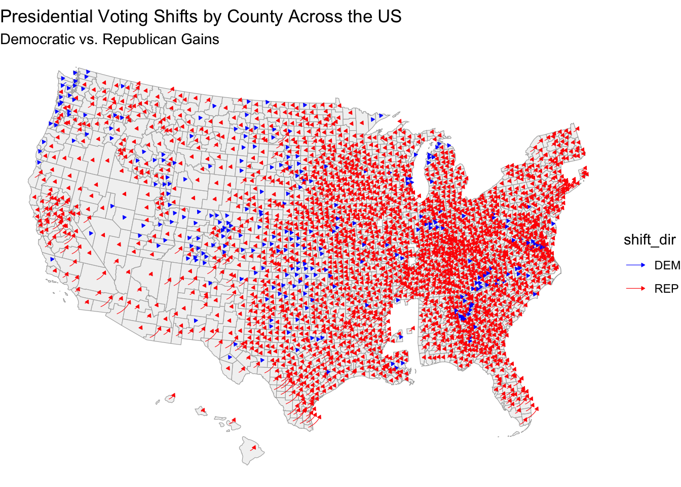
We can see that the large abundance of red arrows, especially concentrated in the Midwest, South, and parts of the interior West, suggests a notable shift toward Republican preferences in these areas, which may have played a significant role in my model’s inaccuracy. If Democratic-leaning voters moved to states or counties where they remain a minority, it wouldn’t substantially shift these areas toward Democrats. However, the loss of these voters in traditionally Democratic urban centers could lead to a less robust base.
Let’s take a more granular analysis of demographic shifts and look at a key battleground state – Pennsylvania:
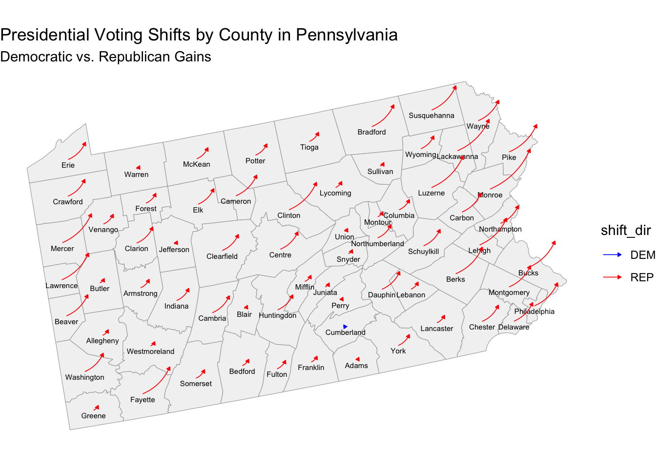
Here, we can see how almost all the arrows are red, indicating a statewide shift toward Republican support across most counties. In general, we’re witnessing many individuals moving out of major urban centers like Philadelphia and Pittsburgh, traditionally Democratic strongholds, into suburban and exurban areas. This shift may dilute Democratic support in urban areas while boosting Republican numbers in counties where these new residents have moved, especially if these areas traditionally lean Republican, impacting our overall model accuracy.
Thus, altogether I believe that incorporating real-time migration data and analyzing its impact on state-level voting behaviors could enhance the model’s predictive accuracy in future elections.
There are several ways in which we could quantitatively test my hypothesis on population shifts. For example, I could collect population change data (2020 to 2024) by county from sources like the U.S. Census Bureau to track shifts in voting patterns (e.g., the percentage change in Republican vs. Democratic vote share). Thus, I could see if counties with significant population increases are more likely to have shifted toward the Republican vote, supporting the idea that new residents have impacted local voting dynamics.
If available, I would look into migration data, such as from the IRS or USPS address data that can help identify where new residents in each county originated. As a result, I could test if areas that received large numbers of residents from Democratic-leaning or Republican-leaning regions.
Armed with this new insight and data, a regression model using predictors like population growth rate, economic factors, and migration patterns would be more robust at predicting the size of voting shifts toward Republicans or Democrats in each county, and the overall two-party vote share. Additionally, a time series analysis could be used to assess whether counties with higher recent migration rates (e.g., 2018-2024) deviated from their historical voting trends more than counties with stable populations.
More specifically, this approach would help to isolate whether recent migration significantly correlates with the somewhat unexpected voting shifts in the 2024 election.
Inflation?
Another pivotal issue that influenced voter behavior was inflation. While my model incorporated economic indicators like GDP, unemployment, and CPI, it did not fully capture the nuanced impact of inflation on voter sentiment. More specifically, while CPI provides a good overall measure of inflation, sources have found that voters continued to express concerns about rising costs in housing and healthcare.
As I reflect on my model, the reliance on historical data may have been limiting, especially when thinking about the unique economic dynamics of the 2024 cycle post-pandemic. Pressure from supply chain disruptions and labor unions presented new challenges that traditional economic indicators may not have been able to capture. Interestingly, research also indicates that voters often respond more strongly to perceived economic threats than actual statistical indicators. The persistent anxiety that inflation creates can erode consumer confidence in the incumbent party and significantly influence voting behavior.
To test this hypothesis, I would propose a correlation analysis between inflation and voting patterns to examine the relationship between inflation rates and voting behavior by analyzing county-level inflation data alongside voting outcomes. This would help determine if areas experiencing higher inflation saw significant shifts in voting patterns. I could enhance the model by using additional inflation indicators, such as the Personal Consumption Expenditures (PCE) Price Index, which may capture consumer spending behaviors more accurately than simply CPI. Of course, I would also have to consider overfitting as a potential issue.
Similar to the previous section, a time-series analysis could provide meaningful insight into how changes in inflation over time correlate with shifts in voting patterns. Similar to out-of-sample tests, I would aim to evaluate the model’s accuracy at varying inflation levels to see if it can maintain accuracy without too much difference in RMSE. If so, further model adjustment would be necessary.
Final Thoughts and Model Adjustments
As the dust settles on the 2024 election, we’ve come a long way since our first exploratory blog post. While our final model provided valuable insights, the actual results remind us that elections are inherently unpredictable. Factors like population shifts and economic fluctuations, particularly inflation, played significant roles that our model didn’t fully anticipate.
As Professor Enos reiterated in class, the core experience of this predictive work is not simply getting the most accurate result, but the growth and learning that comes along the way. Moreover, this reflection plays a broader role in underscoring the importance of continually refining our models to better capture the complexities of voter behavior. By integrating more dynamic data and accounting for emerging trends, we can hopefully enhance our predictive accuracy in future elections.
In the end, the true essence of democracy lies in the power of each individual’s vote, but more broadly, our unique voice. I didn’t realize it then, but I suppose this blog has been an outlet for just that.
Data Sources:
Data are from the GOV 1347 course materials. All files can be found here. All external sources are hyperlinked.